Most mathematical notation is designed with handwriting in mind in the first place, and typography must then try to follow, not always very successfully. However there is a particular type of notation that is, to me at least, more easily done in print than in handwriting: this is the "gothic" or "fraktur" type, typically used to denote Lie algebras, e.g. $\mathfrak{g}$ or $\mathfrak{h}$, or $\mathfrak{su}(2)$ or $\mathfrak{so}(3)$ etc. So my question is, how do you differentiate these objects in handwriting, e.g. with a chalk on a blackboard? How should one write these types of letters, to distinguish the "gothic" $\mathfrak{g}$ from an ordinary $g$?
-
3$\begingroup$ I tend to write them in a sort of angular cursive. It's nothing that would impress anyone in terms of accuracy of script, but it stands apart from other letters, which is all that's needed. However, while this is definitely a question that troubles all mathematicians in Lie theory, I do not think it can be said to be about research mathematics proper, and so probably does not belong on MO. $\endgroup$– LSpiceCommented Dec 25, 2022 at 20:28
-
8$\begingroup$ @LSpice I hope you won't mind if I disagree, but I think that this is a great question for MO. If I'm trying to explain advanced mathematics to a class or my own research to another mathematician while writing on a blackboard, this is knowledge that I'd find very useful. In fact, I already knew of and have used a few of the letters in Gerald Edgar's answer (A, B, G, H), there are others that are new to me and may prove useful in the future. $\endgroup$– Joe SilvermanCommented Dec 25, 2022 at 23:18
-
1$\begingroup$ @JoeSilverman, re, if I minded when people disagreed with me about which posts were suitable for MO, then I'd have a hard time of it. Friendly disagreement in the course of establishing the norms is just how things go. 😄 $\endgroup$– LSpiceCommented Dec 25, 2022 at 23:58
-
1$\begingroup$ I tend to write b, p and q with corners to them but I've never found this reliable for g (which is the letter we really need to distinguish) so I write it in a very distinctive way. For h,m,n, etc. I add a flick to the start of the letter. I don't think I write most other letters any different from usual. This has served me quite well and is certainly enough for personal handwritten notes. $\endgroup$– CallumCommented Dec 26, 2022 at 1:50
-
4$\begingroup$ I don't get this closure. The accepted answer clearly shows that there is an answer that is specific to research-level math. Where else would an underlined letter be understood as a letter in fraktur font? If this is to be closed, then a lot of questions that aren't strictly math questions need to be closed, and I don't think that this would improve MO. How many questions about latex or publishing are on this website? $\endgroup$– Najib IdrissiCommented Dec 26, 2022 at 6:36
3 Answers
Andrew Stacey's homepage includes a wonderful guide on drawing fraktur here.
Here's a copy of the video illustrating it there:
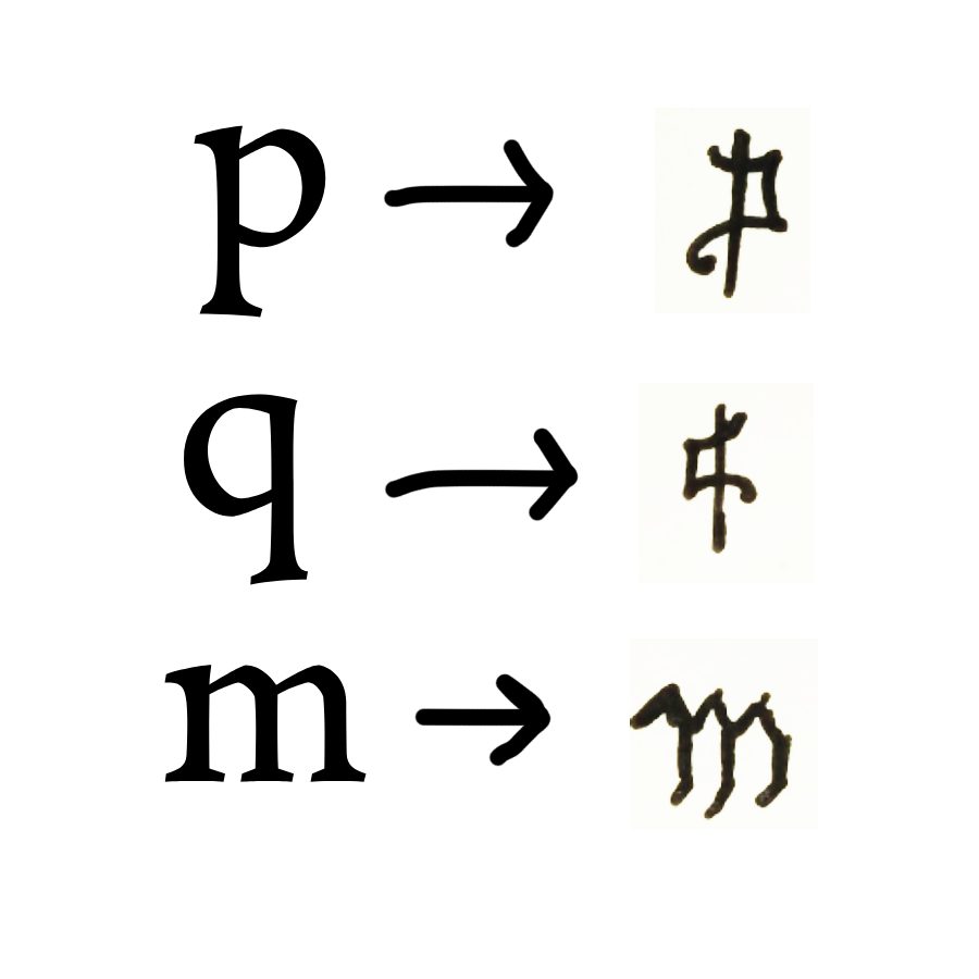
P.S. Adding more features to the above can often be helpful in differentiating these from the Latin script. For example, I've found it helpful to handwrite $\mathfrak{p}$, $\mathfrak{q}$, and $\mathfrak{m}$ like this:

-
2$\begingroup$ This looks very sensible, and is actually close to what I have been doing in practice (kind of square-ish, very stylized, yet still recognizable letter forms)... $\endgroup$– user496902Commented Dec 26, 2022 at 0:14
-
1$\begingroup$ how is this different from the regular script? perhaps you could exhibit the differences please? $\endgroup$– BCLCCommented Dec 26, 2022 at 9:22
-
3$\begingroup$ @BCLC The above letters have a lot of "cusps" or acute angles, which regular script does not (at least not as much). $\endgroup$ Commented Dec 26, 2022 at 15:54
-
4$\begingroup$ @BCLC The main difference is that these have inward curves, so that blackboard fraktur "o" for example becomes concave. This leads to the cusps that Timothy mentioned. $\endgroup$– EmilyCommented Dec 26, 2022 at 17:09
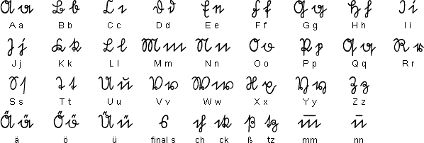
Technically, in mathematics we use "Fraktur" letters, not "Gothic"... These were introduced into mathematics 100 years ago by German mathematicians--in those days it was included in the German elementary schools.
Here is the handwritten form:
-
10$\begingroup$ These look rather like Sütterlinschrift (e.g.)... I'm afraid many of these forms would look very puzzling to non-Germans (especially the lowercase 'e')... $\endgroup$– user496902Commented Dec 25, 2022 at 22:47
-
3$\begingroup$ Let's face it: Greek letters look puzzling to non-Greeks. And so on ... until you learn them. $\endgroup$ Commented Dec 25, 2022 at 22:51
-
3
-
3$\begingroup$ This looks nothing like the fraktur font used in most math papers. Maybe this answer is philosophically "correct," but it's definitely the wrong answer to the question that was asked. $\endgroup$ Commented Dec 26, 2022 at 6:38
-
14$\begingroup$ Historically, this answer is correct: this is how Fraktur symbols were written until the mid-nineteen-eighties at least. Of course, times change, and today this form of handwriting is rare even in Germany. $\endgroup$ Commented Dec 26, 2022 at 7:39
In Lie theory you just add an underline below the letter.
-
1$\begingroup$ may you please exhibit this eg write it take a photo upload it here? $\endgroup$– BCLCCommented Dec 26, 2022 at 9:21
-
1$\begingroup$ This is interesting. Lie algebras make their appearance in algebraic combinatorics (my field) occasionally, but I don't recall seeing anyone using the underline convention. Then again, research talks that use a blackboard are increasingly rare anyway. $\endgroup$ Commented Dec 26, 2022 at 16:00
-
2$\begingroup$ I have also not seen underlines used for Lie algebras in my area (adjacent to Langlands program, where Lie algebras of algebraic groups are abundant) but one of my teachers, who specialized in representation theory of Lie algebras, did use it. So perhaps it's a notation localized to this subarea $\endgroup$– WojowuCommented Dec 26, 2022 at 16:08
-
1$\begingroup$ I see now that there is another MO question that is very similar to this one: Blackboard rendering of math fonts. Also somewhat related is Fraktur symbols for Lie algebras. $\endgroup$ Commented Dec 26, 2022 at 16:23
-
1$\begingroup$ I literally just mean a lowercase letter with an underline. I’m having trouble finding an example on the internet and now I’m worried maybe this is just a Berkeley thing or something. It’s definitely how I’ve done it since grad school. $\endgroup$ Commented Dec 26, 2022 at 17:25


