This may not be an answer to your questions, but it is also too long for a comment. I hope it can be useful, so I leave it here.
First of all, your font looks nice, so I hope you keep up the hard work!
The most important point: I see nobody commenting on the format. If I were to make a math font today, it would certainly be a Unicode math font. There are several reasons for this, one being that most of the symbols people ask for (and many that nobody ask for) do indeed have their slots there. Let me give a few examples in images below, where I have used the Stix Two Math font, which is rather complete.
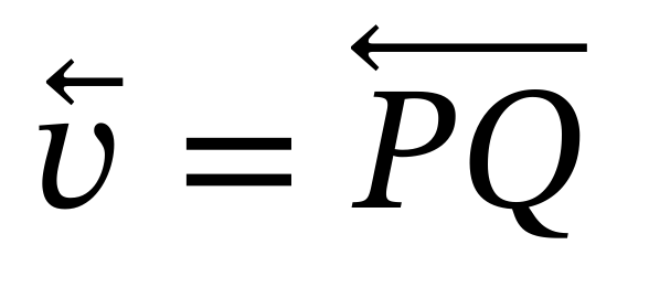
Left pointing arrows as accents:
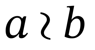
Wreath product (not the symbol asked for, but this one is the one from the official slot U+2240, you could in your font design a better symbol, or having the standard one with an alternative one that people can use):
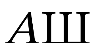
Cyrillic can be there (as well as all capital greeks):
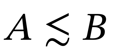
Less than or equivalent to:
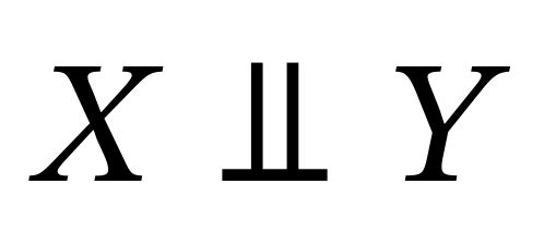
Independent symbol:
Various binary symbols (note here that Stix (top) is not having them uniform while Latin Modern (bottom) do)
One more reason to stay within the bounds of Unicode math is accessibility. If one wants to have the possibility to copy and paste from pdf files it is crucial. If one only cares about the output in the pdf, this is not a big problem.
There are also draw backs with Unicode math. Many alphabets exist, but some are lacking (bold sans greek exist, but sans greek does not, to give an example). It is still possible to use private ranges to make them available for macro packages, but then one should remember that one will not be able to copy and paste and keep their meaning. Another bad thing is that there are gaps in the alphabets. So, italic h is not between italic g and italic i, but somewhere else, because it goes as the Planck constant and the Unicode consortium decided against more than one slot that look the same, or something like that. Bad.
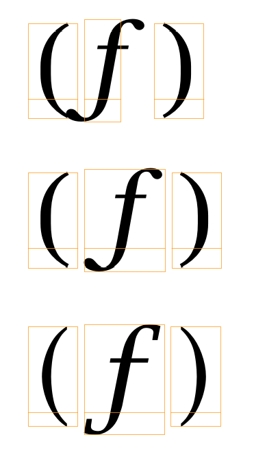
When it comes to implementation, the different existing Unicode math fonts do things a bit differently, and therefore some combinations render a bit bad sometimes. One thing is italic correction. An excessive use of it can make important characters like italic f to be hard to use:
The top line here is (f) in TeX Gyre Bonum Math. It relies heavily on italic correction. On the second line it is how a fixed version can look like. In the third line we see the same expression in Lucida Bright Math. In that font no italic correction at all was used for these kind of symbols, and it still looks very good. Thus, a suggestion is to not make your font depend heavily on italic correction.
When it comes to optical sizes, I would probably not go through the hassle of having and maintaining several versions. The same probably goes through when it comes to bold math. Maintaining a complete bold font seems to be a lot of work. One can already today fake the original font into a slightly bolder one, and for the rare usage in titles, I think it comes out good enough:
A few general (perhaps obvious) suggestions:
- Use many variants for delimiters before going extensible. This is in particular important for the ones that are difficult to have as extensibles (angular brackets for example).
- Make sure that all the accents that can be made to grow do so.
- Add style alternatives for characters that need them. For example the wreath product seems to be one of them. It is then up to the user to choose.
- There are no slots for the calligraphic alphabet, only for the script one. Make sure to add both a calligraphic and a script alphabet. Make one of them a style alternative of the other (this is how it is done in Stix two math). Then the macro packages can make both available, one via
\mathcaland the other via\mathscr, for example. - Be careful where you set the accent anchors, and do set it for all alphabets, not only for the latin italic ones.
- Make the look consistent. The best way to test is probably by using available articles that use various symbols already.
There is much more to say, but I stop here. I look forward to see your new font!

