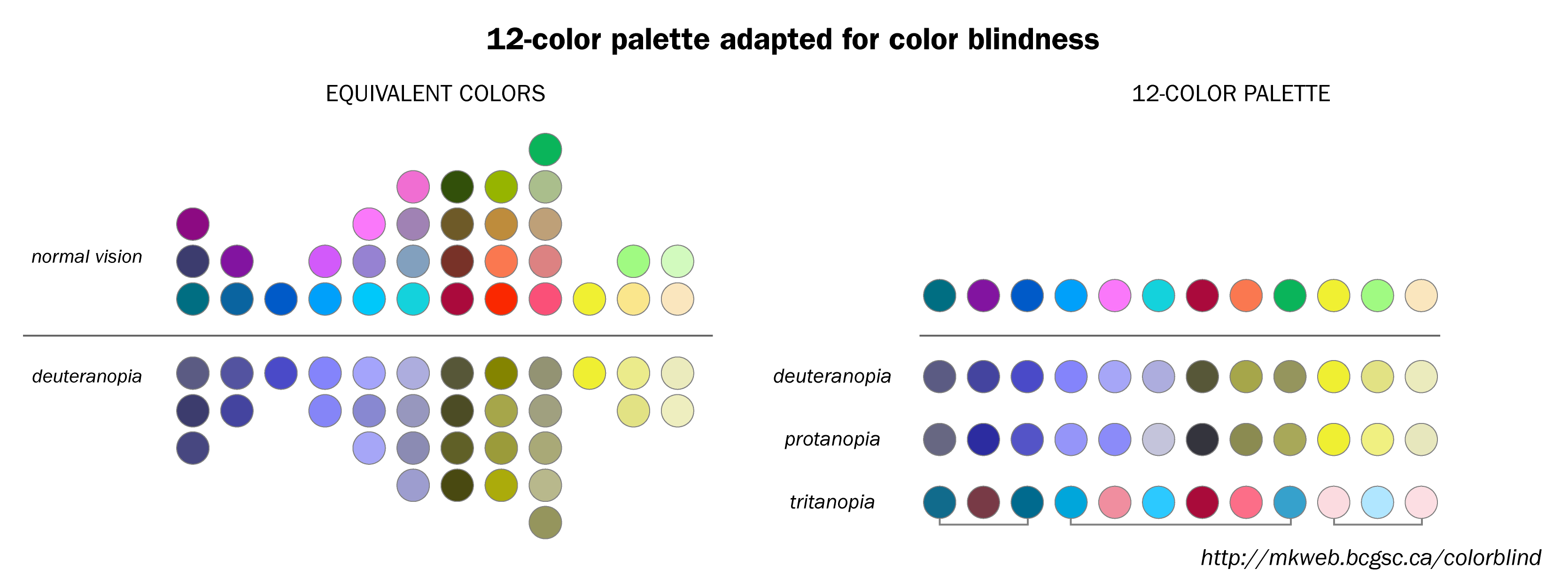
The concern with color figures for grey scale printing is less of an issue these days, when pretty much all displays are in color, so the reader can always check which color is which even if the document is printed in grayscale. (Many journals no longer insist that the figures should display well when printed in grayscale.)
The issue with color blind readers is more substantial. Best practice ("etiquette") is to
- Avoid ambiguous color combinations: green & brown, blue & purple, green & blue, light green & yellow, blue & grey, green & grey, green & black;
- Use a high enough contrast, which most color blind people can still distinguish.
- Use textures instead of / in addition to colors;
- Add a label or graphical element to distinguish different colors.
Here is a color-blind safe palette:

