13
$\begingroup$

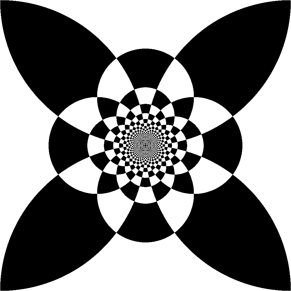
I was making some gifs of Mobius transformations in Matlab, and some strange patterns began to appear. I'm not sure if a deeper knowledge of the filetype/algorithm is needed to understand this phenomenon, but I thought that there could perhaps be a purely mathematical explanation. The image is obtained by coloring the complex plane like a checkerboard, and then inverting it by taking the reciprocal of the complex conjugate. Here is the math psuedocode for the image with a given zoom $k$:

$\mbox{checkerboard}:\mathbb C \to\{\mbox{black},\mbox{white}\}$

$\mbox{checkerboard}(z):=\begin{cases} \mbox{black} & \mbox{if }\lfloor\Im(z)\rfloor+\lfloor\Re(z)\rfloor\equiv 0\mod 2\\ \mbox{white} & \mbox{if }\lfloor\Im(z)\rfloor+\lfloor\Re(z)\rfloor\equiv 1\mod 2 \end{cases}$

$\mbox{image} = \{z\in\mathbb C:|\Re(z)|,|\Im(z)|\leq 1\}$

$\mbox{color}:\mbox{image}\to\{\mbox{black},\mbox{white}\}$

$\mbox{color}(z):=\mbox{checkerboard}(k/\overline{z})$

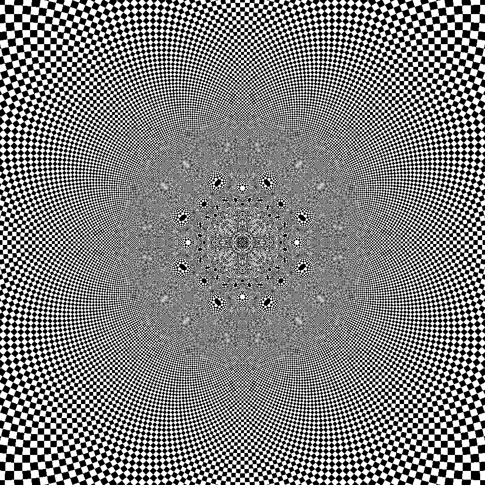
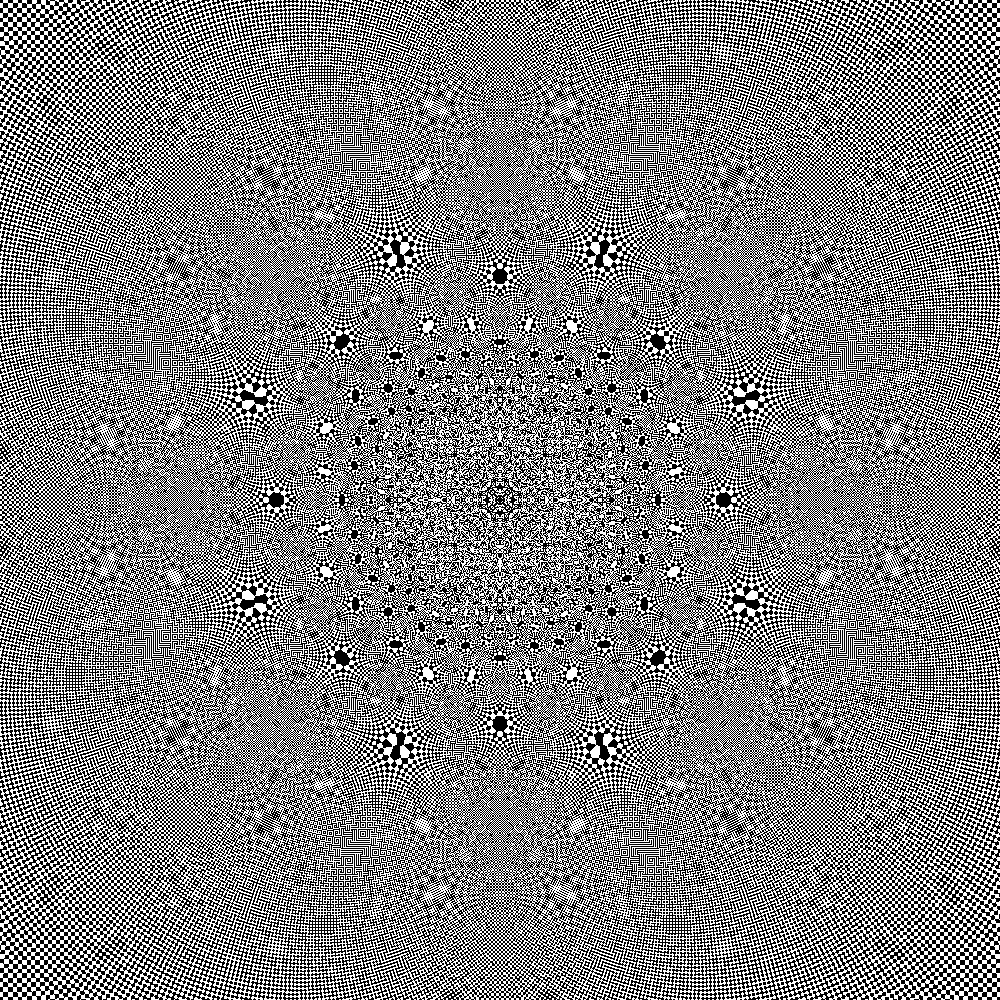
And here are the pictures for $k=1$, $k=50$, and $k=200$. The resolution of each picture is 1000x1000.

$k=1$

$k=50$

$k=200$

EDIT: More specifically, why does the Moiré pattern 'sync up' with the resolution of the picture at certain points? Can the Moiré pattern be predicted?

EDIT (Partial answer): I posted this question on image processing stack exchange, and I got a decent answer for why the pattern syncs up at certain points. I would, however, love a more detailed mathematical explanation of why the pattern seems to behave differently at different such points. Here is a gif I made illustrating the interesting stuff going on when you zoom in: https://media.giphy.com/media/3og0IwUINwEQAYoUDK/source.gif

$\endgroup$
6
  • 3
    $\begingroup$ I'm not sure what "pattern" you're referring to. The last image shows a significant amount of moiré patterns due to interference between the resolution's pixel grid and the pattern: at some places, the two are in a kind of resonance, so apparently undithered patches appear (the fact that both the pixel grid and the pattern are made essentially of squares makes sure that this resonance occurs in both dimensions simultaneously). $\endgroup$
    – Gro-Tsen
    Commented Mar 15, 2017 at 18:12
  • $\begingroup$ The pattern I'm referring to is the undithered patches! Why do the Moiré patterns "sync up" with the resolution at those places? Why is it sometimes solid black dot and sometimes another pattern? It seems as if these places are lattice points that are subject to the same inversion that defines this picture. $\endgroup$
    – B H
    Commented Mar 15, 2017 at 18:21
  • 1
    $\begingroup$ en.wikipedia.org/wiki/Aliasing $\endgroup$
    – Dirk
    Commented Mar 15, 2017 at 18:44
  • $\begingroup$ Similar but simpler effect: Type plot(sin(1:1000),'.') in Octave or MATLAB. $\endgroup$
    – Dirk
    Commented Mar 15, 2017 at 20:36
  • 1
    $\begingroup$ I posted it! dsp.stackexchange.com/questions/38382/… $\endgroup$
    – B H
    Commented Mar 15, 2017 at 21:26

2 Answers 2

5
$\begingroup$

EXTENDED COMMENT

Can you specify what "sync up" means here? All of your drawings are chaotic near the origin since they are trying to pack an infinite amounts of information (the checkerboard) into a very small amount of Euclidean space (the pixels). The best you can do is approximate the Möbius transform (which has become rather chaotic) with the nearest integer value.

the Arnold Cat map is chaotic however if you have a finite amount of pixels it will become periodic with a period related to the Fibonacci numbers, as outlined in a paper of Curtis McMullen.

i think it's clear any good answer involves the word "aliasing" where if we undersample on wave can look like another. spectral theory in hyperbolic space is challenging but maybe there is a good picture here and a quantitative discussion

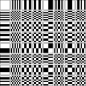
One might check for correlations with basis of Haar Wavelet, Discrete Fourier Transform or Walsh-Hadamard Transform. The basis is exactly the checkerboards of various sizes and scales. These inversion transforms behave like affine maps on a "curved" space. And we can try to work that out.

enter image description here

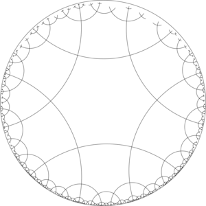
Some of the splotches or "aliasing" I am seeing look like hyperbolic hexagons or octagons.

enter image description here

So a reasonable goal would be to quantify where and how much the inverted checkerboard correlates with these patterns. Or how quickly they are converging to absolute chaos.

$\endgroup$
2
  • $\begingroup$ i am on my phone and have no way to qualify any of this further $\endgroup$ Commented Mar 15, 2017 at 22:47
  • $\begingroup$ I am mostly interested in the points at which the pattern becomes clearer and not grey--in this picture some of them are white dots, some are black dots, some are in between. $\endgroup$
    – B H
    Commented Mar 15, 2017 at 23:00
2
$\begingroup$

(The following is not meant to be a full answer, but a few clues towards one, elaborating what I wrote in a comment. It's a bit too long for a comment.)

There are two things that overlap: one is the grid of square pixels, or more precisely, the "sample grid", namely the points where the "color" function has been evaluated (perhaps at the center of the square pixels, perhaps on one corner, it doesn't really matter, but certainly only at one point per pixel, that is, crucially, no anti-aliasing has been applied). The other is the pattern grid, defined by your function, and which is a conformal transformation (namely, a Möbius transformation) of a regular square grid; being a conformal transformation of a regular square grid, it looks locally like a checkerboard of squares, whose size and orientation are determined by the complex derivative of the conformal transformation applied (that is, of the Möbius tansformation).

Now to better understand what is going on, make two simplifying hypotheses: (A) that the pattern grid is, in fact, a simple square grid (colored in checkerboard pattern), not just locally like one, and (B) while we're at it, that we're only in $1$ dimension. In other words, you have an alternation of white and black intervals of equal length $\ell$ and you evaluate it at a given sample distance $d$. Clearly, if $d$ is equal to $2\ell$, the samples will systematically miss one color and "resonate" with the color, so you get a uniform color; if $d$ is only very close to $2\ell$, you get large intervals of one and the other color with length something like $d\cdot\ell/|d-2\ell|$ (an easy computation if you make a drawing — which I may or may not have gotten right, but it should look like this): it's perhaps clearer to say that the spatial frequency $1/\ell$ of the intervals is shifted by $2/d$, a phenomenon sometimes known as the Nyquist frequency.

Now if we let go of simplifying hypotheses (A) and (B), the places where you see a clear pattern patch emerge are those for which the complex derivative of the conformal transformation applied is such that the square grid which locally coincides with your pattern correctly matches up with the sample grid. One obvious possibility is that the sides of the pattern squares align with the axes of the sample grid, which happens for four different angles, and in each case for just the right size (the edge of the squares being one half the sample edge size), hence essentially in $8$ places arranged in a regular octagon since the derivative of a Möbius transformation is a degree $2$ map; another obvious one is that the diagonals of the pattern squares align with the axes of the sample grid, which also happens for four different angles (and this time the edge of the squares should be $1/\sqrt{2}$ times the sample edge size), so in another $8$ places in another octagon whose axes are shifted $\pi/8$ with respect to the other one and $\sqrt[4]{2}$ times larger. This "explains" the most prominent $16$ patches and why they form two regular octagons (and even the ratio of their sizes).

I don't think I can provide an explanation as to the color at the center of the patches, however, and I'm not sure there's much to be said on this subject.

$\endgroup$
1
  • $\begingroup$ What can probably be explained along the same lines (and with a little more complex analysis than the first derivative) is the shape, rather than color, of the central colored region of each patch. (There is probably a complex analytic map with a singular point with a certain ramification that can be computed there.) $\endgroup$
    – Gro-Tsen
    Commented Mar 15, 2017 at 23:10

You must log in to answer this question.

Not the answer you're looking for? Browse other questions tagged .