10
$\begingroup$

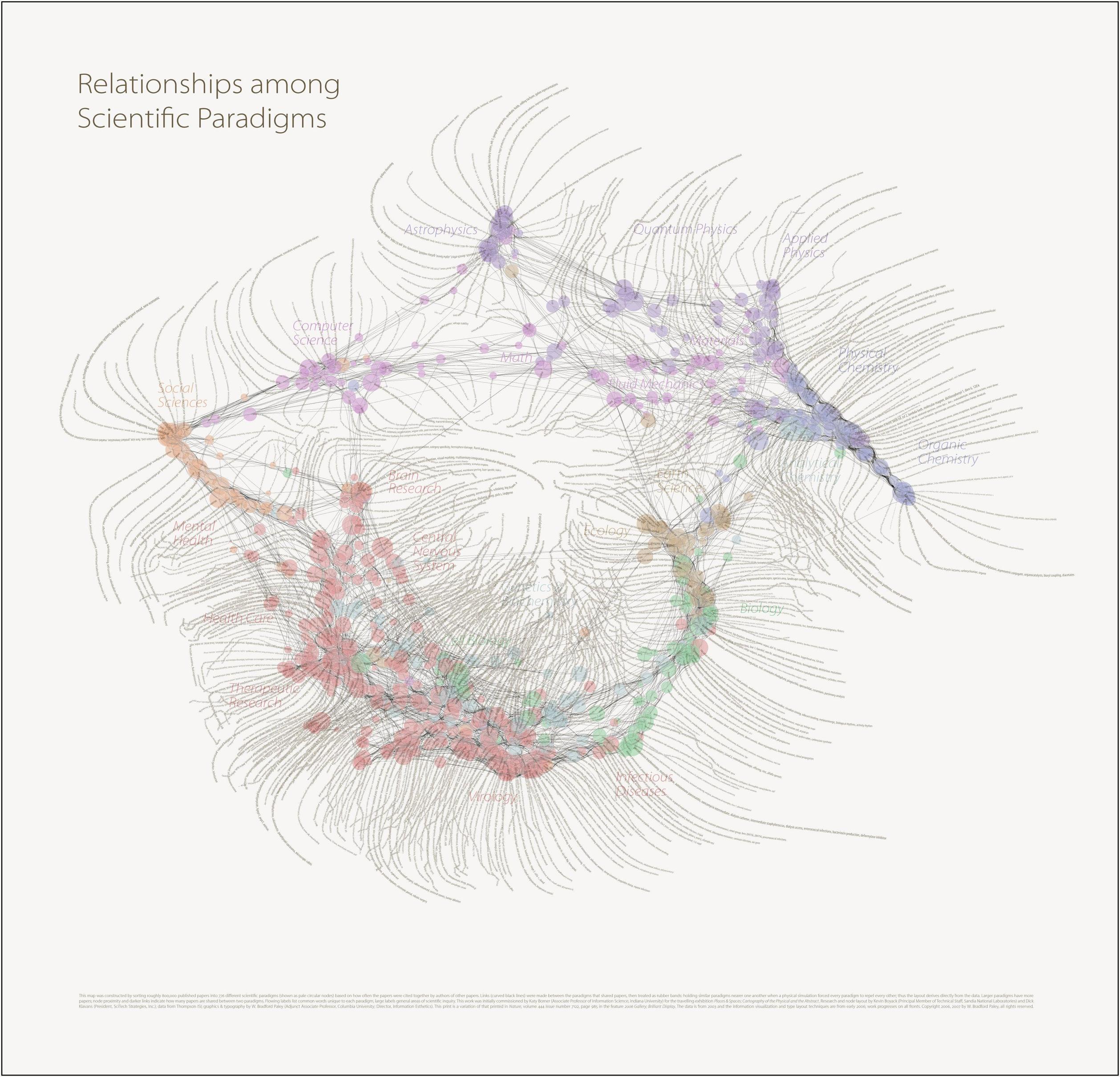
I remember seeing a visualization in the form of a 2d (nodal) graph of all areas of academia, with math, physics and engineering over in one section, connecting in an arc to the central area of economics and statistics which was intermediate between it and the humanities. Psychology and sociology were in their own cluster between the humanities and econ/stats, while biology and medicine formed a huge cloud that branched towards almost everything, though it was further from the humanities than the sciences.

I'm afraid I don't have a link, which would illustrate it much better than I can.

Anyways, I wonder if there's something similar to this for mathematics alone, based on the specialities of co-authors, the references in research papers, common sense, etc. I'd be very interested to see what it looks like.

$\endgroup$

5 Answers 5

11
$\begingroup$

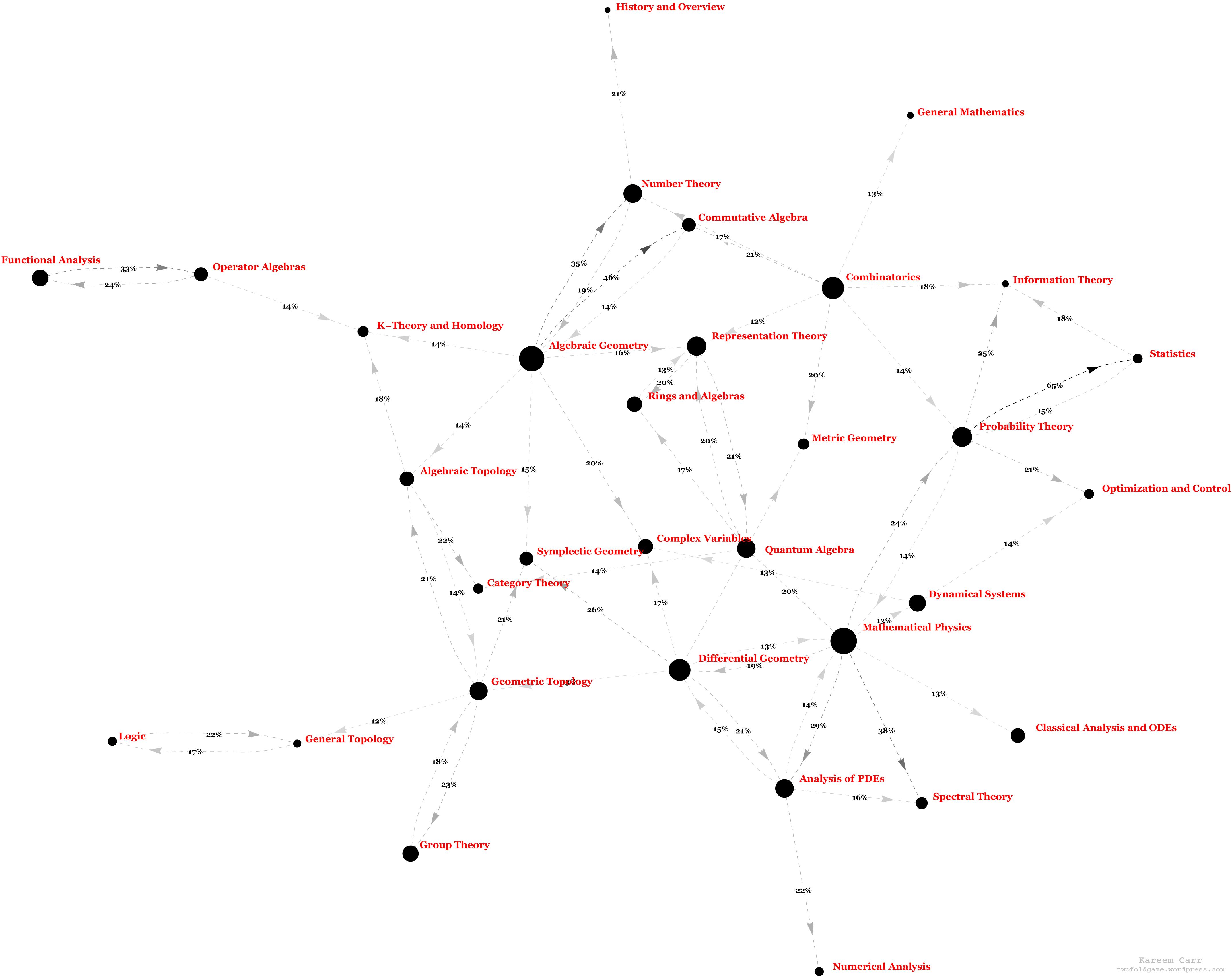
There's a nice 2D map of mathematics here (via Wayback Machine), based on arXiv publications. I think it's pretty close to what you're looking for and is more recent than some of these other maps.

(source: Wayback Machine)

$\endgroup$
1
  • 2
    $\begingroup$ That map is interesting, but the methodology used has its limitations. For example, the analysis of PDEs is heavily tied to functional analysis, though these two areas are widely separated on the graph. (Possibly this is because although PDEs use functional analysis, they don't often need new functional analysis.) $\endgroup$ Commented Nov 9, 2009 at 8:59
9
$\begingroup$

Sorry, I don't know where you can find one for math, but here is a link to the original picture describing all of academia:

(source: Wayback Machine)

$\endgroup$
1
  • $\begingroup$ That is exactly the sort of image I want, though I don't think it's the specific one I remembered - for one, it's much harder to read. It also organizes things somewhat differently, which is a little surprising, given that they're both trying to represent the same data. $\endgroup$
    – DoubleJay
    Commented Oct 24, 2009 at 18:50
4
$\begingroup$

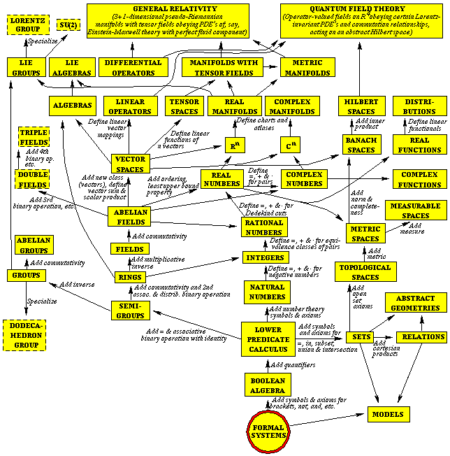
A related picture came to mind. The cosmologist Max Tegmark, when playing with the idea of enconding a TOE in a mathematical structure, developed this quite famous scheme (the original article made the cover of New Scientist):

http://space.mit.edu/home/tegmark/toe.gif

It relates the simplest structures with one another.

$\endgroup$
3
$\begingroup$

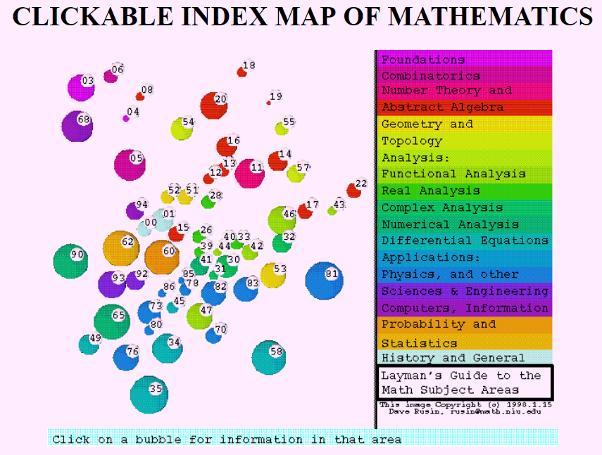
Here's (via Wayback Machine, 2015) something like what I imagine you want, although in the decade or so since this image was made, it's probably changed a fair bit. (For instance, interest in the relationships between analysis, dynamical systems and combinatorics has only been growing since the early '90s.)

As an illustration, here is a static, unclickable, image of the first page:

$\endgroup$
2
  • $\begingroup$ That's what I was going to say. Rusin's page on how it was made (math.niu.edu/~rusin/known-math/collection/mathmap.html) that redoing the map would be a matter of recollecting the data, which sounds easy (for people with the right access) but tedious. Also, there's a relationship between dynamical systems and combinatorics? Tell me more. $\endgroup$ Commented Oct 24, 2009 at 15:46
  • $\begingroup$ Very interesting, this is pretty much what I was looking for, though I was hoping a bit more elaborate/large/aesthetic. $\endgroup$
    – DoubleJay
    Commented Oct 24, 2009 at 18:52
0
$\begingroup$

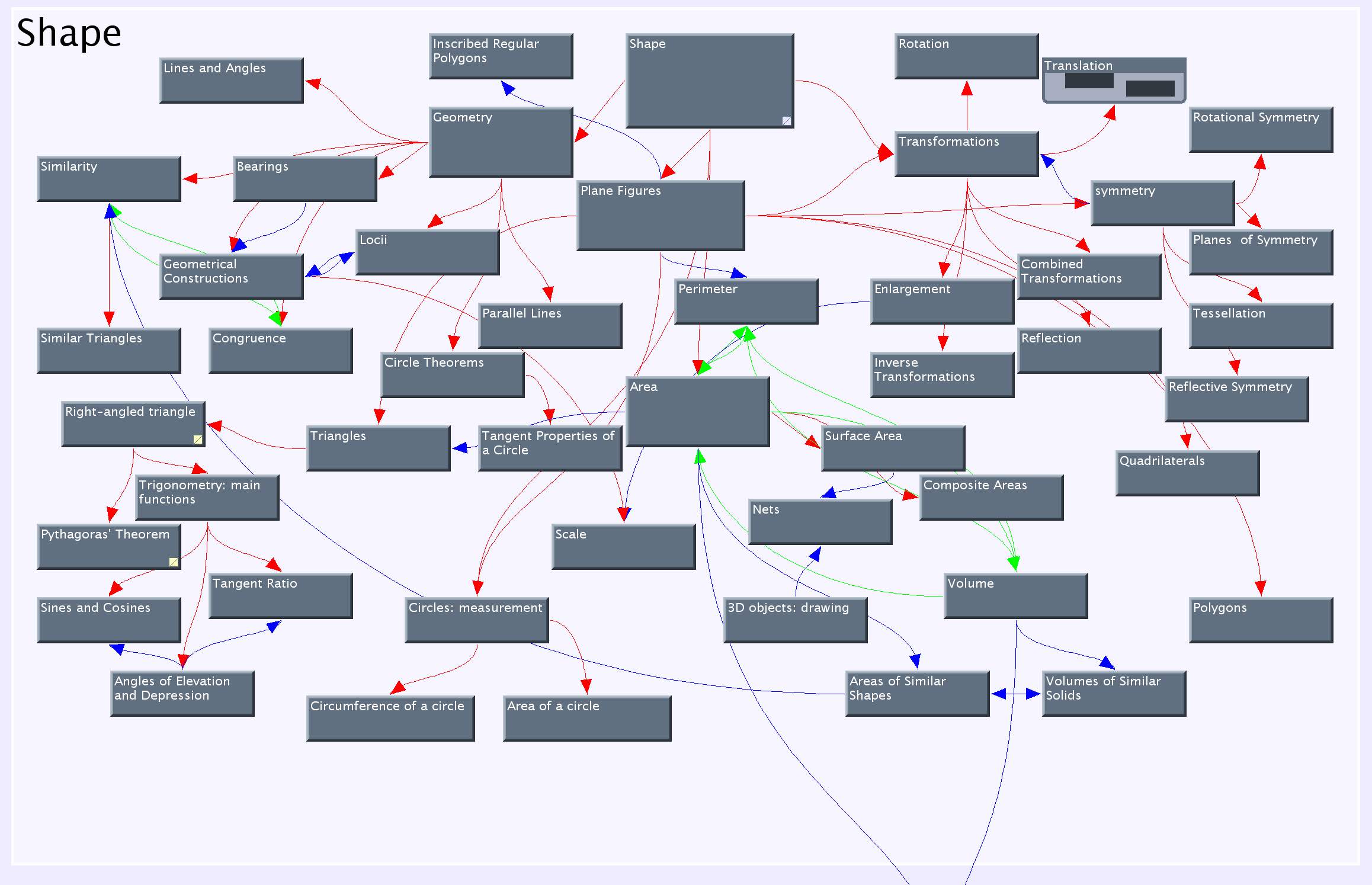
This is a good picture because it shows all the kinds of math together.

(source)

$\endgroup$

You must log in to answer this question.

Not the answer you're looking for? Browse other questions tagged .