44
$\begingroup$

Edit: The project website, GitHub repository, and Discord server for Darwin are now up!


A little context and introduction: I'm currently working on a family of fonts ("Darwin") designed for use in formal writing and optimised in particular for use in mathematics articles, books, etc. It is meant to fill the following requirements, which no currently available fonts for LaTeX fill:

  1. It must be completely free and open-source.
  2. It must have exceptional symbol coverage among many different languages, covering essentially all languages making use of the Latin, Cyrillic, and Greek alphabets.
  3. It must come with a number of optical sizes, which are additional font families with size-specific optimizations―think an extra font for footnotes, a font for usual paragraph text, and an extra font for book covers.
  4. It must come with a matching math font family to uniformise the style across the document. This includes all the usual math symbols as well as font families for \mathbb, \mathsf, etc.

Currently the regular style of the font looks like this (please ignore the currently uneven spacing):

I have also prepared PDF samples of articles in English, Russian, and Greek compiled using the current version of the font, though please note that these contain only the regular style of the text version, and currently have very uneven spacing:

  1. English Sample: Bhatt–Lurie's The prismatization of $p$-adic formal schemes. Original: arXiv:2201.06124.
  2. Russian Sample: Sergei Akbarov's Stereotype Dualities in Geometry. Original: arXiv:2311.05131.
  3. Greek Sample: Grigorios Tachyridis's Krylov subspace methods for the solution of linear Toeplitz systems. Original: arXiv:2303.03223.

I should also note that these samples were compiled from sources of papers directly downloaded from the arXiv, and as such I bear no relation to their authors.


Now, for the actual question: Throughout my own research as well as discussions with friends and colleagues, I've often found situations in math which require special symbols or features from fonts/LaTeX packages, as well as distinct preferences when it comes to certain choices of fonts. For example, these include:

  1. The use of symbols that are specific to certain areas and not usually covered by the default LaTeX fonts, like:

    a) The hiragana よ for the Yoneda embedding in category theory.

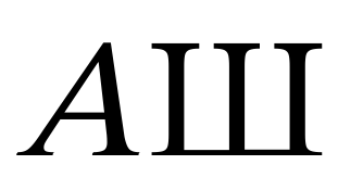
    b) The Cyrillic letter Ш for the Tate–Shafarevich group in arithmetic geometry.

    c) The Cyrillic letter Л for the Lobachevsky function in hyperbolic geometry.

    d) The Cyrillic letter Э for evolutionary vector fields on a jet bundle in some articles, e.g. this one, on the geometry of PDEs, as pointed out by Igor Khavkine.

  2. Better glyph support for \mathcal, \mathbb, \mathfrak, etc., such as:

    a) \mathbb for the lowercase alphabet.

    b) \mathbb for Greek.

    c) More exotic things like \mathcal or \mathfrak for Greek.

  3. A preference of "empty fill" (txof style) over double-strucked blackboard bold (amsbb style) or vice versa, so that having both versions available in a font would be nice:

vs.

  1. A bigger set of delimiters, as discussed here, for situations where one would e.g. need parentheses bigger than \big(...\big) but smaller than \Big(...\Big).

  2. Variable size delimiters for doubled parentheses ((...)), doubled brackets [[...]] and doubled angle brackets << ... >>, a feature request by Willie Wong.

  3. Native and easy handling of bold text and bold math for section and chapter headers, a feature request by Apoorv Potnis.

  4. Built-in optimisation of microtype through a variable width axis, allowing for an even better spacing optimisation than microtype already wonderfully does.

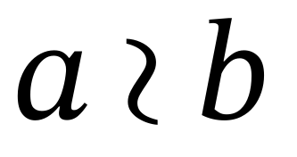
  5. Symbols for binary relations that are missing from current LaTeX packages, such as inequality versions of $\asymp$, a feature request by Iosif Pinelis.

I plan to address all these points and more in the development of Darwin, but I'm sure the above list is anything but exhaustive, and there ought to be countless more such features which would benefit the community. So, in the spirit of the items above, I'd like to ask: are there any font features you want to have as part of your work, but weren't available or required workarounds at the time you thought of them?

Here "features" should be understood as including things in the spirit of the above examples, but not limited to them.

I also want to point out that suggestions without technical details are more than welcome. Part of the reason I wanted to ask this question on MO instead of somewhere like TeX.SE is that I believe mathematicians not familiar with type design or the technicalities of LaTeX surely also have extremely valuable feedback to offer. So, for example, suggestions like "this symbol sketched by pencil below would work great for doing [x] in area [y], but I'm not aware of an implementation of it, or find the current ones flawed because of [reason]" would also be exceedingly welcome.

$\endgroup$
45
  • 8
    $\begingroup$ See also the MO meta discussion for this question, which preceded it: Link. $\endgroup$
    – Emily
    Commented Feb 10 at 21:05
  • 2
    $\begingroup$ Inequality counterparts of \asymp are, strangely, missing in available LaTeX packages, but I guess this is not a matter of fonts. $\endgroup$ Commented Feb 11 at 3:23
  • 9
    $\begingroup$ In item 2, \mathbb for digits would also be nice. $\endgroup$
    – indicator
    Commented Feb 11 at 15:38
  • 2
    $\begingroup$ @Stian Yes. Incidentally, the font will come with a sans-serif counterpart of matching style as well. $\endgroup$
    – Emily
    Commented Feb 11 at 23:36
  • 2
    $\begingroup$ @FedericoPoloni My impression was that Willie Wong was being neutral on the question of whether the question was suitable for MO. But your reading could be correct. As for English usage, I agree that "alternative" often (though not always) carries the connotation of "one or the other but not both". However, if I suggest an alternative, it does not necessarily mean that I am recommending it; sometimes I am just generating options for consideration. $\endgroup$ Commented Feb 12 at 21:00

8 Answers 8

10
$\begingroup$

Here is my own personal wish list (or rather a partial one, consisting of the items I can come up with off the top of my head). Some of them have existing workarounds, and some of them are perhaps not directly solvable by creating a new font, but I figure it's better to err on the side of making suggestions that may not be useful, than to not say anything at all.

  • Regarding blackboard bold, I personally prefer a style with vertical rather than curvy lines, such as in the title of this old paper of mine.
  • You didn't mention Hebrew letters; these are used to denote infinite cardinalities. As mentioned here, the default $\aleph$ and $\beth$ do not have a uniform appearance.
  • There does exist a symbol for the wreath product of two groups: $G\wr H$, but I think I'm not alone in finding it unsatisfactory, having a somewhat nondescript appearance. When I first encountered the wreath product symbol in Nathan Jacobson's book Basic Algebra I, it looked a lot more like a reverse integration symbol. See page 79: Jacobson's symbol for wreath product I don't know what other people think of that version, but I think it's better than $\wr$. Some circumstantial evidence that people don't really like $\wr$ includes: (1) I often see people writing $\text{wr}$ for the wreath product, which is pretty weird if you think about it (offhand, I can't think of any other product that people represent using two Latin characters), and (2) in Richard Stanley's book Enumerative Combinatorics Volume 2, he uses the symbol $\S$ instead (which I don't particularly like either, but at least it's more distinctive than $\wr$).
  • There are three graph products that are closely related to each other: $G\times H$, $G\boxtimes H$, and $G\mathbin{\square} H$. I had to kludge the last one using \mathbin\square (as of this writing, Wikipedia doesn't even bother with \mathbin and so it looks even worse). Admittedly, this kludge works reasonably well, but I think it would look nicer if the three symbols all had the same size (compare $\times \otimes$ with $\times \boxtimes$), which they currently don't.
  • Sometimes one wants a modified summation symbol, e.g., $$\mathop{{\sum}'}_{m,n} {1\over (mz + n)^{2k}}.$$ This is discussed in Exercise 18.44 of Knuth's original $\rm\TeX book$, where he points out that the above solution \mathop{{\sum}'} centers the limits on the primed summation sign rather than the original summation sign. The workaround for that is much more complicated. I don't think that it's necessary to create separate symbols for every possible accent that someone might want to decorate the summation symbol with; offhand, I think I've only ever seen $\sum'$ and $\sum^*$. An example of the former may be found in Jean-Pierre Serre's book A Course in Arithmetic, Chapter VII, Section 2.3.
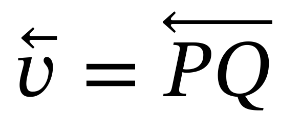
  • Sometimes I want to put an arrow over something to indicate that it's a vector. If I just want a rightward-pointing arrow then \vec is usually fine; e.g., $\vec v$. But if I want an arrow going in the opposite direction, then the only easy solution I know is to use \overleftarrow, as in $\overleftarrow{v}$, which is clumsy. Using a harpoon instead of an arrow looks a bit more elegant to me, but seems to be complicated to implement. It would nice if extensible arrows or harpoons in both directions were easily implemented.
  • There are many different ways that people like to write the symbol for a disjoint union. Some are well supported; others are less so. I don't have particularly strong feelings on the topic but thought I would mention it because it does seem to come up a lot.
$\endgroup$
12
  • 4
    $\begingroup$ Just so that you know: the homegrown implementation of LaTeX on Wikipedia in theory supports \mathbin, \mathrel, and the like, but in practice they have no effect, because due to a mindbogglingly stupid design decision, the parser normalizes LaTeX input such that it puts braces around everything. $\endgroup$ Commented Feb 11 at 13:45
  • 2
    $\begingroup$ I know it's not the point, but, just for reference (and until we have this new font!), amsmath provides $\displaystyle\sideset{}'\sum_{m, n} \frac1{(mz + n)^{2k}}$ \sideset{}'\sum_{m, n} \frac1{(mz + n)^{2k}}, and an answer to a TeXSE question of mine (which was a duplicate suggested an ingenious double-\reflectbox, \reflectbox{$\vec{\reflectbox{\!$v$}} (obviously best encapsulated as a macro, as in that answer!). $\endgroup$
    – LSpice
    Commented Feb 11 at 17:04
  • 3
    $\begingroup$ 2) The wreath symbol in Jacobson is really interesting; I had never seen it before, but I did feel a bit dissatisfied with the symbol $\wr$ for wreath products. This makes me wonder whether there are similar situations for other symbols, unavailable in LaTeX but nice and useful in practice. $\endgroup$
    – Emily
    Commented Feb 11 at 18:14
  • 4
    $\begingroup$ 3) The unconsistent size for binary symbols like $\mathord{\times}\mathord{\otimes}\mathord{\boxtimes}\mathord{\square}$ had always bothered me too, I think there are probably even more such symbols in practice which could be standardized in size with respect to each other, like e.g. $\mathord{\diamond}$ as in $\mathord{\times}\mathord{\otimes}\mathord{\boxtimes}\mathord{\square}\mathord{\diamond}$. $\endgroup$
    – Emily
    Commented Feb 11 at 18:15
  • 2
    $\begingroup$ 4) Extensible arrows, both as in $\vec{v}$ and $\underset{\scriptsize\to}{v}$ as well as in $A\xrightarrow{f}B$, are another point that always bothered me. There are even a few of these that are used in practice but lack a standard implementation, such as ⇸ for profunctors, Riehl–Verity's arrows as in e.g. Definitions 1.1.24 and 1.1.25 of their book, a version of $\rightleftarrows$ with $\dashv$ for adjunctions, and so on. I'll probably end up implementing dozens and dozens of these. $\endgroup$
    – Emily
    Commented Feb 11 at 18:17
9
$\begingroup$

Here are the suggestions I can think of

  • Legible mathfrak capitals, i.e. easily distinguishable glyphs that resemble their latin counterparts enough that an uninitiated reader can easily tell which one it's meant to be. Like the Mathematica mathfrak I guess. Obviously a balance needs to be struck between legibility and tradition, but I find the illegibility of the default mathfrak adds an unnecessarily barrier to understanding sometimes.

  • For mathematical writing it would be nice if punctuation such as parentheses wouldn't be slanted in the textit font. Punctuation doesn't get slanted in math mode, so in theorem-like environments that use italic text you often see a mixture of slanted and upright punctuation and it looks weird, e.g.

enter image description here

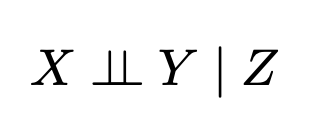
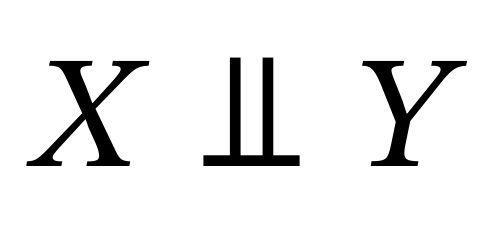
  • For specific symbols, conditional independence is represented by something usually written as \perp\!\!\!\perp, as in

enter image description here

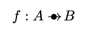
and in category-theoretic probability an arrow with a dot on it is often used for stochastic morphisms, as in

enter image description here

I guess ideally the dot would be a bit smaller than the \bullet I used here. I don't think either of these exist as a single symbol in any font.

$\endgroup$
4
  • $\begingroup$ I'm not sure how I feel about "legible mathfrak." Part of the point of Fraktur, or script, is to introduce a symbol that is obviously different from the Latin counterpart. If they look too similar to each other, then that defeats the purpose. At the same time, I recognize that (for example) $\mathfrak{S}$ looks like an uppercase G to many people. Maybe something like Lucida Fraktur, as shown here, is a reasonable compromise. $\endgroup$ Commented Feb 12 at 14:53
  • $\begingroup$ @TimothyChow $\mathfrak{A}$, $\mathfrak{Y}$ and $\mathfrak{V}$ are all pretty hard to identify as well, and how many people know which is which out of $\mathfrak{J}$ and $\mathfrak{I}$ without looking it up? That Lucida one is pretty legible to me - I don't think I'd have any trouble telling which letter each one is. (Except for the G, which looks like $\mathfrak{S}$.) $\endgroup$
    – N. Virgo
    Commented Feb 12 at 15:33
  • 1
    $\begingroup$ @N.Virgo Thank you so much for your suggestions! I'll be sure to implement all of them :) $\endgroup$
    – Emily
    Commented Feb 12 at 18:47
  • 1
    $\begingroup$ On blackletter, I also find the default font for \mathfrak quite confusing for some glyphs. There have been lots and lots of different renderings of blackletter throughout the years; for example, this book collects 300 different renderings, and naturally there are even more. I'll be sure to aim for a design that accounts for all these points! $\endgroup$
    – Emily
    Commented Feb 12 at 18:48
8
$\begingroup$
  1. Bold versions of the blackboard bold letters. It's common to want $\mathbb{R}$ or $\mathbb{C}$ as part of a section heading, e.g.

    $\textbf{Conjugacy classes in $\textbf{GL}_{\boldsymbol{n}}(\mathbb{R})$}$

    and the $\mathbb{R}$ looks out of place because of the stroke weight.

  2. If it's possible to make \overline align well with characters, that would be helpful. The default overline alignment is very poor, e.g. $$ \overline{f},\quad \overline{j}, \quad\overline{s}, \quad\overline{A}, \quad\overline{B}, \quad\overline{V} $$ Using \bar only fixes some of these, doesn't match the look of \overline, and has its own problems with some other letters: $$ \bar{f},\quad \bar{j},\quad \bar{s},\quad \bar{A}, \quad\bar{B},\quad \bar{V}, \quad \bar{d}, \quad \bar{m}, \quad \bar{M}, \quad \bar{T} $$ There are similar issues with \widehat. All of this can be fixed with well-chosen \mkern's, but it should be automatic.

$\endgroup$
4
  • $\begingroup$ Thank you so much for the suggestions! I've had so much frustration with \overline and similar commands over the years; I remember there was a TeX.SE question with a nice but quite complicated implementation that worked really well for arbitrary math (like $\overline{\int^{\infty}_{-\infty}\exp(-x^{2})\,\mathrm{d}x}$), but unfortunately had a tendency to break when used together with certain packages. I'll be sure to implement a easy and nice way to handle all this, as well as appropriate versions of symbols for section headers/titles/etc. Again, thank you so much! $\endgroup$
    – Emily
    Commented Feb 12 at 0:24
  • 8
    $\begingroup$ Your comment about blackboard bold makes sense, but I also find it amusing that blackboard bold, which presumably began as a cheap trick to simulate bold letters on a blackboard, is now so entrenched that even on a computer, our instinct is to thicken the lines rather than just use a plain old bold $\mathbf{R}$. It reminds me of someone who would physically tie down his cordless phone so that he wouldn't lose the handset. $\endgroup$ Commented Feb 12 at 0:44
  • $\begingroup$ Given that usually different typefaces for letters are used to denote different quantities I am always puzzled if people want variables names in bold in titles. I never do that. A boldface R is not an R and not a blackboard bold R… $\endgroup$
    – Dirk
    Commented Feb 12 at 17:35
  • $\begingroup$ @Dirk Yes, and ultimately formulas in titles are just a hassle: they break pdf table of contents (since that's plain text and we need to tell TeX explicitly what plaintext to put there), are difficult to decorate (such as underlines for weblinks), and headers sometimes have capitalized section titles where they behave weirdly... $\endgroup$
    – Trebor
    Commented May 8 at 10:03
5
$\begingroup$

The theme of this answer is "incomplete math fonts". Most of the special math fonts currently don't even cover the full alphanumeric Latin alphabet (let alone other alphabets):

  • \mathbb is missing support for lowercase letters (as mentioned in the question) and digits (as mentioned by user @indicator in the comments, linking to the discussion here).
  • \mathcal is missing support for lowercase letters (TeX.SE discussion) and digits (TeX.SE discussion).
  • \mathscr is missing support for lowercase letters (TeX.SE discussion) and digits.
  • … (This answer is community wiki, so others are invited to add any additional examples that fall within this category.)

Arguably, all of these can be considered to be separate fonts, and probably have alternatives in Xe(La)TeX, but it would be nice to have them somehow belong to the same font family and be available in LaTeX.

$\endgroup$
2
  • $\begingroup$ Thanks for the suggestions! I'll be sure to add these too :) $\endgroup$
    – Emily
    Commented Feb 13 at 19:58
  • $\begingroup$ What is a calligraphic digit? What is a script digit? If you used one of them, would your readers recognize it? $\endgroup$ Commented May 6 at 17:45
4
$\begingroup$

Unlike the somewhat obscure scripts you mentioned for particular/unique mathematical symbols, Greek is used constantly in math for all sorts of things. LaTeX has lowercase and uppercase versions of many Greek letters: $\pi$ and $\Pi$, for instance. However, when the uppercase of a Greek letter is identical to its Latin counterpart, there is no special uppercase version in LaTeX: for example the uppercase of $\alpha$ looks like $A$ (although possibly it should not be italicized) so there is no "\Alpha" command.

This is understandable. However, in many cases I would like a "bigger" version of my Greek letter symbol that is distinct from its Latin counterpart. The one example that really comes to the top of my mind is $\chi$. Chi is used for many things in math/physics/statistics, and it looks particularly bad with subscripts because of how "low" the default letter is. Take a look at how the chromatic polynomial of a graph $G$ is written: $\chi_G(x)$. The $G$ and the $\chi$ sit at almost the same level, even though the $G$ is supposed to be a subscript here. This problem is discussed also at https://tex.stackexchange.com/questions/191551.

It might be a little weird, but you could consider somehow incorporating bigger versions of the lowercase Greek letters that don't have unique uppercase forms. Or at least try to fix chi.

$\endgroup$
5
  • $\begingroup$ Thanks for the suggestion! I think the problem with $\chi$ is that it is supposed to descend to the same level as $f$, but since it doesn't also ascend to the same level as $f$, subscripts end up appearing weird, e.g. $\chi_G$ vs. $f_G$. Maybe a solution could be having the subscripts for $\chi$ placed lower to account for this, or have $\chi$ not descend as much. I'll experiment with this to figure out the relative advantages of each approach when implementing it. $\endgroup$
    – Emily
    Commented Feb 12 at 18:57
  • $\begingroup$ On the bigger versions of the other Greek letters, could you give me some examples of situations where you wanted to use them, or found having them at hand would benefit the exposition? $\endgroup$
    – Emily
    Commented Feb 12 at 18:57
  • 1
    $\begingroup$ Possibly a solution is just to make \Alpha produce A, \Beta B and so on. I guess this is easy to do with a LaTeX macro, and not necessarily something related to fonts. In that case, the issue with $\chi$ extending too far below the line is maybe orthogonal. I guess extending this request, it would be nice to make sure most symbols have a consistent placement, even if this goes against the way they are normally handwritten, because in math subscripts and superscripts are used so often and so having the relative vertical placement of symbols be consistent is important. $\endgroup$ Commented Feb 12 at 19:18
  • 2
    $\begingroup$ Is the subscript issue really a problem with $\chi$ specifically? Do you also want to similarly "correct" $g_G$, $p_G$, $q_G$, $y_G$? If so, then that seems to be something you'd want to fix in $\rm\TeX$ rather than in the font. $\endgroup$ Commented Feb 12 at 20:36
  • 1
    $\begingroup$ @TimothyChow: Fair point, and I don't know if this is really a font issue vs. a TeX issue. But yes to me none of those look quite as bad as $\chi_G$ does. $\endgroup$ Commented Feb 12 at 21:43
3
$\begingroup$

Not sure if this has been mentioned, but many mathematicians are missing a \bigtimes similar to \bigotimes = $\bigotimes$.

$\endgroup$
3
  • $\begingroup$ Thank you for the suggestion! I'll be sure to implement it as well. $\endgroup$
    – Emily
    Commented Feb 12 at 18:49
  • 1
    $\begingroup$ A TeX.SE discussion (that I discovered through @MichaelHardy's currently HNQ A MathJax/LaTeX question) mentions \varprod. $\endgroup$
    – LSpice
    Commented Feb 12 at 23:27
  • 1
    $\begingroup$ In the same fashion, one misses \bigast, as a larger \ast$=\ast$, which typically denotes the free product of groups. $\endgroup$
    – YCor
    Commented Feb 23 at 17:04
2
$\begingroup$

This may not be an answer to your questions, but it is also too long for a comment. I hope it can be useful, so I leave it here.

First of all, your font looks nice, so I hope you keep up the hard work!

The most important point: I see nobody commenting on the format. If I were to make a math font today, it would certainly be a Unicode math font. There are several reasons for this, one being that most of the symbols people ask for (and many that nobody ask for) do indeed have their slots there. Let me give a few examples in images below, where I have used the Stix Two Math font, which is rather complete.

Left pointing arrows as accents:

leftpointingarrows

Wreath product (not the symbol asked for, but this one is the one from the official slot U+2240, you could in your font design a better symbol, or having the standard one with an alternative one that people can use):

wreath product

Cyrillic can be there (as well as all capital greeks):

cyrillic

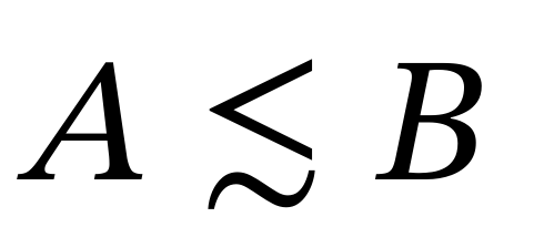
Less than or equivalent to:

lessthanorequivalentto

Independent symbol:

independent

Various binary symbols (note here that Stix (top) is not having them uniform while Latin Modern (bottom) do)

binarysymbols

One more reason to stay within the bounds of Unicode math is accessibility. If one wants to have the possibility to copy and paste from pdf files it is crucial. If one only cares about the output in the pdf, this is not a big problem.

There are also draw backs with Unicode math. Many alphabets exist, but some are lacking (bold sans greek exist, but sans greek does not, to give an example). It is still possible to use private ranges to make them available for macro packages, but then one should remember that one will not be able to copy and paste and keep their meaning. Another bad thing is that there are gaps in the alphabets. So, italic h is not between italic g and italic i, but somewhere else, because it goes as the Planck constant and the Unicode consortium decided against more than one slot that look the same, or something like that. Bad.

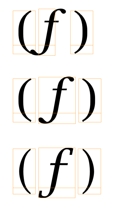
When it comes to implementation, the different existing Unicode math fonts do things a bit differently, and therefore some combinations render a bit bad sometimes. One thing is italic correction. An excessive use of it can make important characters like italic f to be hard to use:

fff

The top line here is (f) in TeX Gyre Bonum Math. It relies heavily on italic correction. On the second line it is how a fixed version can look like. In the third line we see the same expression in Lucida Bright Math. In that font no italic correction at all was used for these kind of symbols, and it still looks very good. Thus, a suggestion is to not make your font depend heavily on italic correction.

When it comes to optical sizes, I would probably not go through the hassle of having and maintaining several versions. The same probably goes through when it comes to bold math. Maintaining a complete bold font seems to be a lot of work. One can already today fake the original font into a slightly bolder one, and for the rare usage in titles, I think it comes out good enough:

bold in math

A few general (perhaps obvious) suggestions:

  • Use many variants for delimiters before going extensible. This is in particular important for the ones that are difficult to have as extensibles (angular brackets for example).
  • Make sure that all the accents that can be made to grow do so.
  • Add style alternatives for characters that need them. For example the wreath product seems to be one of them. It is then up to the user to choose.
  • There are no slots for the calligraphic alphabet, only for the script one. Make sure to add both a calligraphic and a script alphabet. Make one of them a style alternative of the other (this is how it is done in Stix two math). Then the macro packages can make both available, one via \mathcal and the other via \mathscr, for example.
  • Be careful where you set the accent anchors, and do set it for all alphabets, not only for the latin italic ones.
  • Make the look consistent. The best way to test is probably by using available articles that use various symbols already.

There is much more to say, but I stop here. I look forward to see your new font!

$\endgroup$
4
  • $\begingroup$ Thank you so much for such a detailed reply and for the encouragement, mickep! (And let me also apologise for taking a little bit to reply; I had to deal with some life stuff that precluded me from replying sooner) $\endgroup$
    – Emily
    Commented Feb 23 at 16:41
  • $\begingroup$ I'm not too sure about this point yet as I have only been working on designing the text fonts for now, but the main point that worries me with designing "Darwin Math" as a unicode open type math font is that I'm not sure it will work with pdflatex, which is absolutely crucial in order for the font to be used in papers appearing in the arXiv, which doesn't yet support LuaLaTeX or XeLaTeX as compilers. (Is this indeed the case, that it is not possible to implement unicode opentype math fonts with pdflatex?) $\endgroup$
    – Emily
    Commented Feb 23 at 16:41
  • $\begingroup$ So, assuming this is indeed the case, my current plan is to implement it first on pdflatex, and then later perhaps reimplement it also as a unicode math font for use with LuaLaTeX or XeLaTeX. $\endgroup$
    – Emily
    Commented Feb 23 at 16:42
  • $\begingroup$ > There is much more to say, but I stop here. I look forward to see your new font! First of all, thank you so much for the encouragement, I hope you'll like the final result once it's ready! Second, let me say that I'm all ears in case you'd like to say more, I'm really grateful for your suggestions, and will always be eager to hear them! Again, thank you so much :) $\endgroup$
    – Emily
    Commented Feb 23 at 16:42
1
$\begingroup$

One point which I want to clarify is that of special and unusual symbols for variables or objects: besides the relatively common ones I mentioned in the question body, such as ш for the Tate–Shafarevich group or よ for the Yoneda embedding, there are a few articles that use even more specific characters, such as:

  • Fiorenza–Loregian's Recollements in stable $\infty$-categories, which uses the Georgian letter რ for "a (donné de) recollements";
  • Fiorenza–Loregian–Marchetti's Hearts and towers in stable $\infty$-categories, which uses the kanji 切 for the "class of slicings of stable $\infty$-categories";
  • Some articles relating to the work of Satake, such as those involving Satake compactifications, the Satake isomorphism, etc. use the katakana サ, e.g. Namikawa's Toroidal Compactification of Siegel Spaces;
  • Some articles use Hebrew letters that are not conventionally used in mathematics, such as Tsadi (צ) and Mem (מ);
  • I've used the kanji 忘 (from 忘れる, to forget) in my own work to denote forgetful functors.

I plan to support such usage as well in the form of requests in cases where such unusual notation is reasonable/beneficial. Such requests could either be opened as issues in the GitHub tracker for the font (a link will be added here as soon as it's ready), or by just communicating it to me by email, Discord, etc.

$\endgroup$
10
  • 1
    $\begingroup$ 切 and 忘 are also the Chinese words for "slice" and "forget." That could be considered an advantage or a disadvantage. It might be confusing, in a mathematical paper written in Chinese, for a Chinese word to be used as a symbol. In English, it would be akin to letting forget denote a forgetful functor. $\endgroup$ Commented Mar 5 at 18:28
  • $\begingroup$ @TimothyChow I had never wondered what notations like this would look like in a paper fully written in Chinese or Japanese. I think in Japanese it would either look okay and not be confusing or at there would be simple ways to write for it not to be confusing. $\endgroup$
    – Emily
    Commented Mar 6 at 13:50
  • 1
    $\begingroup$ Here's an idea (not necessarily a good idea, but something to think about): maybe the kanji / Chinese character could be italicized, just as we typically italicize variable or function symbols. $\endgroup$ Commented Mar 9 at 6:24
  • 1
    $\begingroup$ Chinese may not "officially" use italics, but advertising billboards and logos have used slanted characters as an attention-grabber since time immemorial. One example that comes to mind is the logo for Coca-Cola, 可口可樂, which as you can see is distinctly slanted. $\endgroup$ Commented Mar 9 at 22:35
  • 1
    $\begingroup$ I would say that single-character chinese names is not very confusing in chinese contexts. "设 $忘$ 为遗忘函子" is perfectly clear to me, as long as the typesetting is decent. $\endgroup$
    – Trebor
    Commented May 8 at 10:09

You must log in to answer this question.

Not the answer you're looking for? Browse other questions tagged .