83
$\begingroup$

I’m working on a paper that makes heavy use of colorful diagrams to supplement the text. For most of these it would probably not be possible to create grayscale versions that convey the same information as effectively. I’m a bit worried about this because (1) I imagine that some people like to print out papers to read them but these people might not want/be able to print in color, and (2) some readers may be colorblind.

What are the expectations on an author in my situation? Will it be considered rude to leave as-is, so long as the diagrams are not technically necessary to verify the arguments? Am I expected to include a description in the captions (“this region is red, this region is blue...”)? Or most stringently, would I be expected to post a “colorblind version” somewhere that tries to recreate the diagrams in grayscale as best as I can?

I’m interested in all opinions, but especially those of people who would have trouble with color for whatever reason.

$\endgroup$
8
  • 22
    $\begingroup$ When I used different colors in my thesis, I also made a point to change other characteristics as well, for example thickness, or if the line is dashed etc. $\endgroup$
    – Thomas Rot
    Commented Apr 1, 2018 at 17:38
  • 6
    $\begingroup$ The printing issue seems more important to me - I often print papers to read them. More importantly, are you certain that the journal will print the diagrams in color? It would be odd if the officially printed version of the paper did not have the colors that the paper refers to. $\endgroup$ Commented Apr 2, 2018 at 0:29
  • 1
    $\begingroup$ colorbrewer2.org is a great resource for colour palettes $\endgroup$ Commented Apr 2, 2018 at 18:27
  • $\begingroup$ There are several questions discussing similar topics on academia.se: academia.stackexchange.com/questions/34327, academia.stackexchange.com/questions/13616, academia.stackexchange.com/questions/95792. $\endgroup$ Commented Apr 3, 2018 at 16:13
  • 3
    $\begingroup$ You already received excellent answers, but as a colorblind person I'd very much prefer you did not use colors at all. (I do not have a particularly severe form of colorblindness but even so colored charts can be surprisingly confusing) $\endgroup$ Commented Apr 4, 2018 at 0:01

6 Answers 6

84
$\begingroup$

The concern with color figures for grey scale printing is less of an issue these days, when pretty much all displays are in color, so the reader can always check which color is which even if the document is printed in grayscale. (Many journals no longer insist that the figures should display well when printed in grayscale.)

The issue with color blind readers is more substantial. Best practice ("etiquette") is to

  • Avoid ambiguous color combinations: green & brown, blue & purple, green & blue, light green & yellow, blue & grey, green & grey, green & black;
  • Use a high enough contrast, which most color blind people can still distinguish.
  • Use textures instead of / in addition to colors;
  • Add a label or graphical element to distinguish different colors.

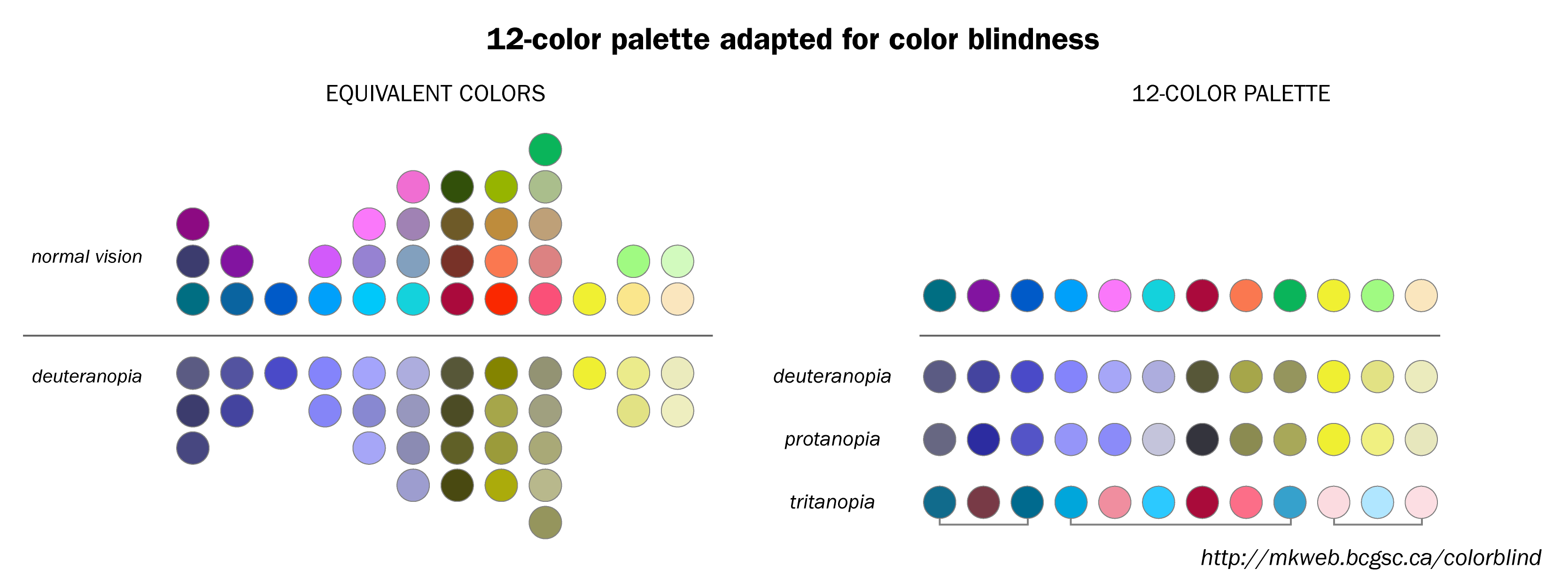
Here is a color-blind safe palette:

$\endgroup$
5
  • 16
    $\begingroup$ This is an excellent answer, but I'm having some trouble understanding exactly how your chart is meant to be interpreted. Is the chart on the left a 'choose one from each column' situation? What's the deal with the chart on the right, and what are the lines under the tritanopia row? $\endgroup$ Commented Apr 2, 2018 at 12:39
  • 17
    $\begingroup$ here is how I understand the charts: on the left you see how colors are seen by someone with normal vision (top panel), and someone with a particular form of color blindness (bottom panel); this chart is a warning: colors in a single column that are easily distinguished by normal vision are very similar for the color blind; then the chart on the right will help you to choose colors that can be distinguished by persons with one of three forms of color blindness; if three colors suffice, choose one from the first 3 elements on the top row, one from the next 6 elements, and one from the last 3. $\endgroup$ Commented Apr 2, 2018 at 13:55
  • 2
    $\begingroup$ @Emilio note also that the lines in the second diagram connect colours that seem very similar. It could be that this is not a selection interval, but a way to draw more attention to unsafe colour choices. $\endgroup$
    – Orphevs
    Commented Apr 3, 2018 at 8:04
  • $\begingroup$ @Orphevs By my reckoning, it seems to be drawing attention to the fact that people with tritanopia will still struggle with this pallet, but I'm guessing that pallet is the best compromise between the three major forms of colour blindness. $\endgroup$
    – SGR
    Commented Apr 3, 2018 at 14:08
  • 1
    $\begingroup$ The second and third color from the right are still hard to distinguish for me, same for fourth and fifth.... $\endgroup$
    – koalo
    Commented Apr 3, 2018 at 18:22
9
$\begingroup$

I can share my own experience. To make the diagrams with colored edges we use different line styles (dashed, dotted, bold, normal). We post the color version in the arxiv. When people print it b/w, the style of the lines still can be distinguished. Of course we explain in the text writing something like this: red line (dashed)... .Some journals publish color pictures in online versions. Few journals publish color pictures on paper.

For other types of diagram you can fill the regions with different filling style, AND use color. The regions will differ both in color and in b/w print.

$\endgroup$
2
  • $\begingroup$ Actually, a lot of journals do publish color figures on paper. But you have to pay for it. $\endgroup$ Commented Apr 4, 2018 at 0:58
  • $\begingroup$ @Michael Renardy 1: I never pay anything to the journals. Out of principle. $\endgroup$ Commented Apr 4, 2018 at 2:16
5
$\begingroup$

As a complement to Carlo Beenakker's very good answer, I suggest to have a look at the palettes proposed by Paul Tol. He purports to answer the very questions you asked. You can find his work summarised on his webpage, which includes a link to his detailed technical note on colour schemes.

$\endgroup$
3
$\begingroup$

Paper:   instead of one, let there be two identical diagrams except for different color codings.

Online:   one may have several color codings for the same diagram; only one at the time would show up on the screen--then click-click, and you switch from one encoding to another.

$\endgroup$
3
$\begingroup$

The top answer makes a substantial omission. Red-green color vision deficiency is not even considered (the most common one).

In this case blue and green are excellently distinguishable, but red and green not in every case. The color chart is not really easy to distinguish at all.

Also even if common, color blind is a misnomer, because usually people see those colors, just that certain shades have a higher contrast than others.

Colors that are not clearly distinguishable for "normal" vision, can be clearly distinguishable for people with so called color vision deficiency (such as more shades of yellow).

So, in real it's more of a preferred color depending on your way to view. "Normal" vision is not necessarily the more complete vision, just the commonly shared color palette most people perceive equally well.

The key to good color selection is to use high contrast, and avoid using non primary colors. This gives the best results. If you need more than 5 colors, you should use other ways to clearly distinguish information. It should be clearly and easily distinguishable if you view it in grayscale. That works for everyone.

$\endgroup$
3
$\begingroup$

Of course going through existing coloured diagrams and redesigning them in a monochrome (or grey-scale) colour scheme would be a lot of work, and depending on the complexity of the diagram the diagram may actually benefit from the use of colour.

But just because no other answer has mentioned the benefits of black & white (or greyscale) diagrams:

  1. there are no issues for people with colour vision deficiency

  2. many journals do not print in colour (unless you are prepared to pay for colour printing), so library copies will usually be black & white

  3. some researchers will print the electronic version (or view it on an ebook reader) and having diagrams compatible with standard black & white laser printers is very convenient (not only for the printed journal copy).


Even though colours can be helpful, every diagram can be redesigned in black & white and there are several techniques for distinguishing elements as you would with colour:

lines

  • style (solid, dotted, dashed, ...)
  • thickness

objects

  • shape (circle, square, triangle, diamond, cross, ...)
  • filled vs. unfilled

areas

  • pattern (plain, striped, dotted, checkered, ...)
  • direction of pattern
$\endgroup$

You must log in to answer this question.

Not the answer you're looking for? Browse other questions tagged .