I learned most of my math font rendering from watching others (for example, I draw ζ terribly). In most cases it is passable, but I'm often uncomfortable using fonts like Fraktur on the board. Does anyone know good resources for learning to write these passably?
-
16$\begingroup$ I just want to say that I never learned how to write Fraktur letters. This is at least a partial explanation why I became a combinatorialist -- combinatorics rarely uses such letters. $\endgroup$– Michael LugoCommented Nov 17, 2009 at 22:24
-
2$\begingroup$ Someone with good handwriting should do some short youtube clips, like the one I saw recently showing a way (which I dislike) to draw $\mathbb{Z}$. $\endgroup$– alekzanderCommented Nov 17, 2009 at 23:53
-
1$\begingroup$ @alekzander: obviously this couldn't be done for the whole range of symbols used, but if you give me a short list of problematic letters, then I could do that. $\endgroup$– Andrew StaceyCommented Nov 18, 2009 at 7:42
-
2$\begingroup$ I would be very happy if someone did a Youtube video on how to write the minuscule, majuscule greek letters as well as the fraktur and cursive fraktur letters (those always look like two differents fonts to me). I would do it myself if I knew all fraktur letters... $\endgroup$– Konrad VoelkelCommented Nov 18, 2009 at 14:56
-
1$\begingroup$ @Konrad: Is the video I link in my answer below anything like what would be useful? If so, it was easy to do so I can do more. $\endgroup$– Andrew StaceyCommented Nov 18, 2009 at 16:26
11 Answers
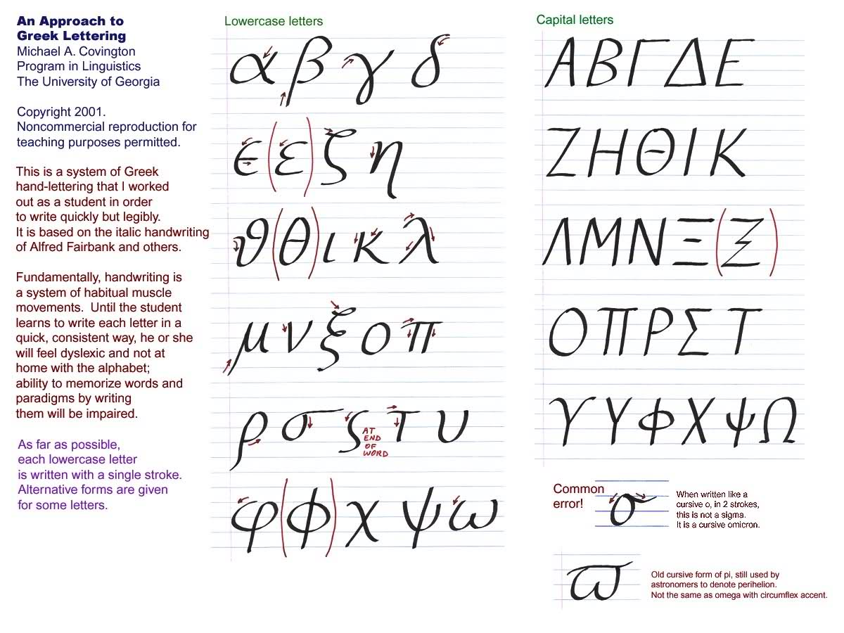
I often give this to Freshmen. Learning the right way to start with is easier than trying to change later.
-
3$\begingroup$ Hmmm ... Looks like I've been drawing my lower-case deltas, rhos and sigmas the wrong way (against the arrows) all these years. Maybe because I'm a lefty? For theta, I make a full (clockwise) circle --starting either at far left, or at top, or in-between-- looping all the way back around to the far right, where I pull leftward for the crossbar; if I'm being especially tidy, I'll pick up my pen before drawing the crossbar. $\endgroup$– BlueCommented Aug 23, 2010 at 11:52
-
1$\begingroup$ The site ibiblio.org/koine/greek/lessons/alphabet.html has rho drawn in the opposite direction, so I don't think that aspect is of much importance. The appearance of the result and reproducibility are more significant. I'm still looking for an analogous guide to Fraktur (and Gothic). $\endgroup$ Commented Jan 24, 2014 at 12:01
-
$\begingroup$ There seems to be a source for this from the original author. $\endgroup$– user114668Commented Jan 11, 2019 at 14:01
Suggestion number one:
Learn Calligraphy! It's a lot of fun and does mean that you can write the fonts in genuinely nice ways. Books on calligraphy tend to have detailed instructions on how to do at least the basic alphabets: explaining which stroke to do first, and how to hold the pen. Although not all of it transfers to the blackboard, it helps a lot. For example, once you seen how the different "g"s are written, you'll know how to write the Lie algebra symbol correctly. However, I do find that a script S ($\mathcal{S}$ is not even close) can take me a couple of goes to make it look right - it shouldn't be pointy at the top but should sweap backwards.
(Note: to anyone reading the comments, I originally had this answer together with my other answer in the same post. Given the comments, I decided to split them.)
Following up on aleksander's comment to the original question, I had a go at doing a video of how to draw a fraktur g (𝔤) (well, actually it's gothic but if you know the difference you don't need this video, and the gothic g is probably more distinguishable from a normal g than a fraktur one on a blackboard). It's not very polished, but you can see what it looks like here (actually, this is currently a dead link, see the video linked below). It was quite fun to do so if this would be helpful, I can easily do more.
Edit (March 2017): Thought I'd update this with a link to something longer I wrote on this which can be found here.
Edit (Nov 2019): I made a video of how to write the lowercase fraktur alphabet that I describe in the above article. It's available on youtube.
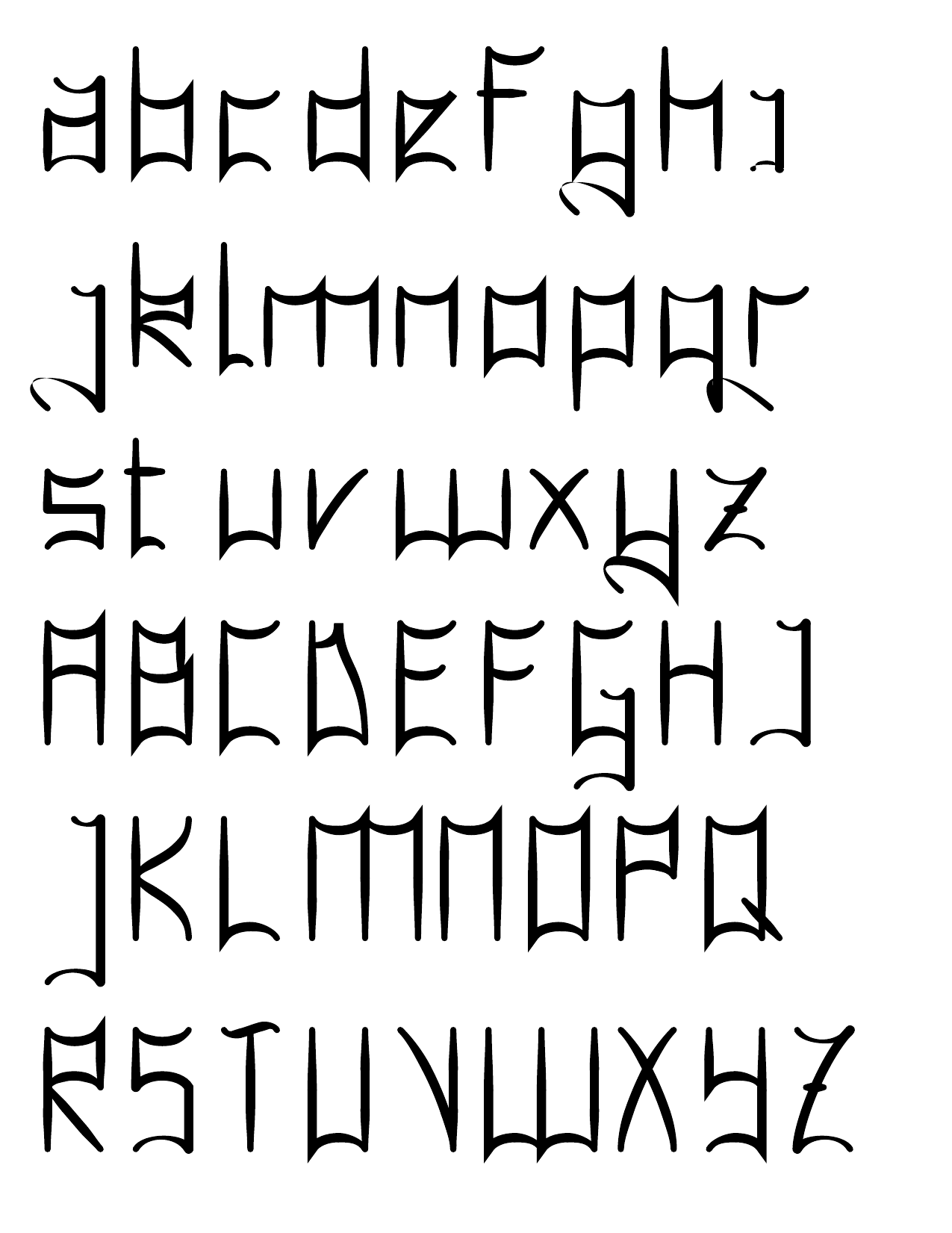
I've also had a go at capital letters for the fraktur typeface. The current version looks like:
-
1$\begingroup$ Shame you didn't split this into two answers - I agree with 1, and would've voted accordingly; but disagree (for me personally) with 2, and would have avoided voting for that one... $\endgroup$ Commented Nov 17, 2009 at 21:38
-
$\begingroup$ Same as Mikael. Agree with 1 but disagree (rather strongly) with 2. $\endgroup$– GMRACommented Nov 17, 2009 at 22:07
-
1$\begingroup$ Good thing I'm not desperate for reputation! I wasn't sure if, on a non-community wiki post, two answers was really allowed. However, I think that the calligraphy answer is the real one so I'll separate the two and see if that causes an outcry on meta. $\endgroup$ Commented Nov 17, 2009 at 22:16
-
$\begingroup$ Well, I provided two answers to one of your questions once, so it's clearly not disallowed. Maybe frowned upon, though – neither earned any points after all. $\endgroup$ Commented Nov 17, 2009 at 22:27
-
2$\begingroup$ @KConrad Looks like 2 1/2 years is the correct answer to your question ... sorry for the long delay (and feel free to critique it). $\endgroup$ Commented Nov 2, 2019 at 22:12
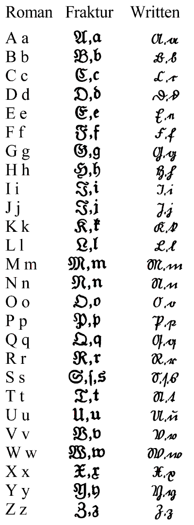
This webpage (scroll down to "German") has a nice chart about fraktur letters and how they should look when handwritten:
I must admit I don't have enough experience writing fraktur letters, I really should learn to write them properly.
-
2$\begingroup$ Nice. but if you try writing c, d and e the way they show them, no mathematician (except maybe a German one) will have any idea what you are writing. $\endgroup$ Commented Apr 4, 2011 at 8:35
-
1$\begingroup$ The "written Fraktur" is actually Suetterlin (an 18th century invention, IIRC), not Fraktur. Fraktur is written exactly like it looks (and is called Fraktur for being "broken", as in, a letter is not supposed to be written with a single stroke of the pen); it's not like 14th century monks had printers or something :) $\endgroup$ Commented Mar 20, 2017 at 18:26
-
3
-
1
-
$\begingroup$ The Fraktur capital I and J are identical? $\endgroup$ Commented Jul 24 at 3:49
This is sort of goofy, but if you have a tablet, you could try training yourself with Detexify. Try to get it to give you the indended symbol with as good (low) a score as possible. If a computer can read your writing, a human probably can too!
When I'm stuck on a problem, I practice writing letters in various fonts. I suppose this isn't up to par with other mathematicians' doodles (I'm told Riemann would calculate the cube root of 3), but it keeps my handwriting reasonably neat.
I've often thought that someone should write a book on mathematical calligraphy. Maybe not a full course on it, but as it stands the symbols we use are so inconsistent and often look little like they should, simply because we all "guess" how to draw them.
How did we learn when younger how to write in cursive, or to write in general? We practiced. The suggestion to learn calligraphy is a good one, but it seems that someone should do something like that specifically for mathematicians, somewhere.
-
$\begingroup$ I don't know a book on mathematical calligraphy, but I do know a calligraphic book on mathematics. Joe Roberts, Elementary Number Theory. archive.org/details/Elementary_00_Robe/page/n9/mode/2up $\endgroup$ Commented Jul 24 at 3:55
Although only a minor point, remember that many old fonts were written with a pen or quill. You only get a strong line on a down-stroke. From this you can sometimes work out the best way to draw a character, if you think of think of the rhythm of the character and make the wider stronger lines downward lines. It's almost impossible to get a thick upward line with a nib. FWIW.
I have never heard of anybody teaching how to write on a blackboard. There are a lot of books about calligraphy. You could try finding a calligraphy book with a font close to Fraktur.
By the way, you can find tips on how to write greek letters: http://www.ibiblio.org/koine/greek/lessons/alphabet.html
-
3$\begingroup$ This is such a good idea (a course on writing on a blackboard), I'm going to steal it and add it to the "what should be taught at university" question! $\endgroup$ Commented Nov 17, 2009 at 19:40
For the greek alphabet you just need to practice (or take ancient Greek in high school!) For mathfrak, I've just decided to use a double underline when writing (paper or blackboard) the names of Lie algebras.
Suggestion number two:
Get rid of the blackboard. The way to guarantee that the fonts look right is to have a computer display them (either by directly projecting or by printing out slides first). This also means that you can use colour and other fun things.
To forestall the deluge of "How can you suggest getting rid of blackboards?" posts, all I'll say is that I think that I give better lectures and seminars when I use a computer than when I use a blackboard. The difference is probably more in the way that using a computer forces me to prepare it than in the method of delivery, but it works for me.
(Note: I suspect that people will be strongly tempted to vote this answer down. Please read the second paragraph first.)
-
6$\begingroup$ I think it would be really unfair to downvote just because people disagree, it's a perfectly good answer. I can see your point about preperation, but I think people who just use a beamer, or something like that, tend to go too fast. I usually follow lectures on blackboards much better then the beamer ones. $\endgroup$– GMRACommented Nov 17, 2009 at 22:37
-
2$\begingroup$ While I do think that transparencies and slides have their place I generally prefer to give and feel like I get more out of blackboard talks. I think that writing notes like they were slides and then using them to give a blackboard talk is a great suggestion though (but not an answer to Tyler's question). I'd definitely encourage you to post this as an answer if a suitable question already exists or comes up (and I haven't distorted your answer to the point where you disagree with it!) $\endgroup$ Commented Nov 17, 2009 at 23:12
-
1$\begingroup$ If you used a laptop that was also a tablet then you could write things like a blackboard. Less need to prepare before hand. $\endgroup$ Commented Nov 18, 2009 at 1:32
-
2$\begingroup$ I've actually seen this done - the speaker had pre-prepared certain 'slides' on the tablet and annotated them as he spoke. I thought it worked really well. $\endgroup$ Commented Nov 18, 2009 at 2:49
-
$\begingroup$ @Kim: I do this in my current lecture course. I use a combination of beamer and xournal and a graphics tablet (can't afford a tablet PC) and I think it works well - though maybe you should ask the students. $\endgroup$ Commented Nov 18, 2009 at 7:40
Concerning the greek letters, it is essential to know the following: there does not exist in the greek language a cursive style (joined-up writing, schreibschrift). To my knowledge, at least. And has never existed. As a further point, the greek z should be written as a 3. It is essentially the same symbol, I should say.
-
1$\begingroup$ "The greek z should be written as a 3. It is essentially the same symbol" - No, it's not the same symbol! $\endgroup$– QfwfqCommented Jul 3, 2018 at 19:30
-
$\begingroup$ Well, I will not insist on this.. $\endgroup$ Commented Jul 9, 2018 at 17:34


